This month's spotlight is all about flavor and form. I designed a set of minimalist pasta posters for a client's kitchen, blending simple shapes with iconic Roman dishes. Scroll down for tasty visuals (plus a few fun extras).
Minimal Pasta Posters for a Roman Kitchen
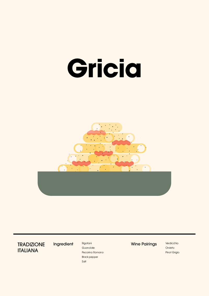
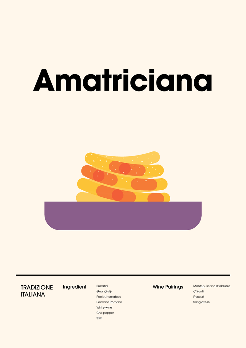
I created this series of posters for a client's kitchen. The goal was to keep it super minimal — just simple shapes and colors to represent four iconic Roman pasta dishes. The chosen classics: Carbonara, Amatriciana, Gricia, and Cacio e Pepe. No details, just form and flavor.
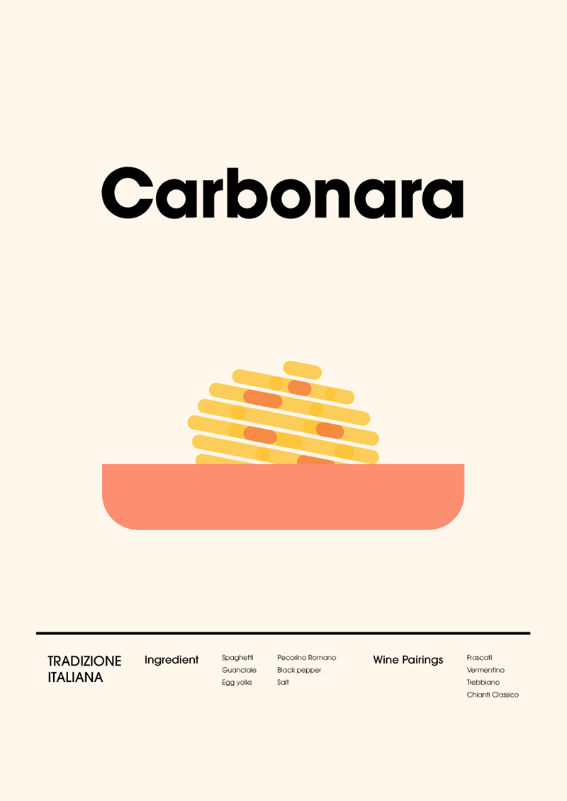
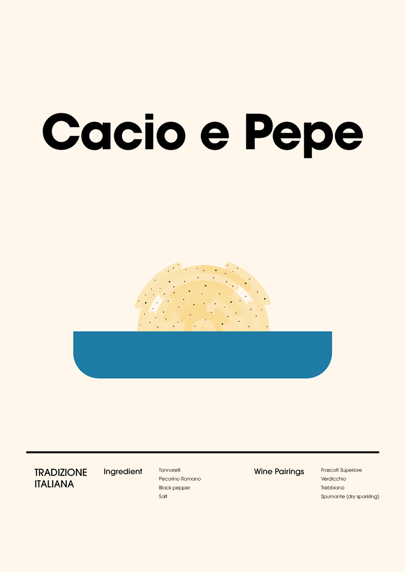
The challenge was finding the right balance: keeping each dish visually simple, but still unique and recognizable. I had to translate ingredients into clean, flat forms without losing their identity.
Turning "Bad Habits" Into Good Design
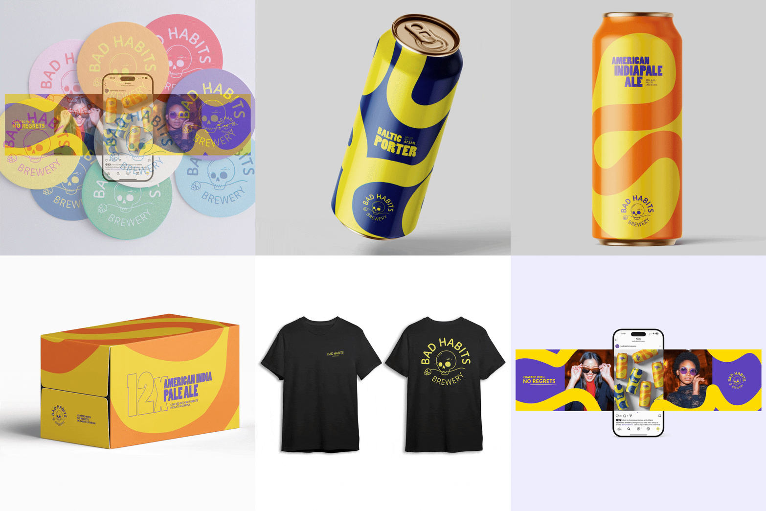
This case study dives into the making of Bad Habits Brewery, a bold, independent beer brand with a name that turns heads—and a skull for a logo. The challenge? Making something that could've felt intimidating into a brand that's vibrant, fun, and shelf-ready. From playful visuals to strong packaging design, here's how I transformed edgy elements into something drinkers would be excited to pick up and try.
Check out some of my videos from YouTube
